deviant art


Login
Join deviantART for FREE Take the Tour Lost Password?
Deviant Login
Shop
 Join deviantART for FREE Take the Tour
[x]

More from ~rebel28

Featured in Groups:

Details

February 3
8.7 MB
3840×2160
Link
Thumb

Statistics

Comments: 4
Favourites: 6 [who?]
Views: 598 (3 today)
Downloads: 184 (0 today)
[x]
:iconrebel28:
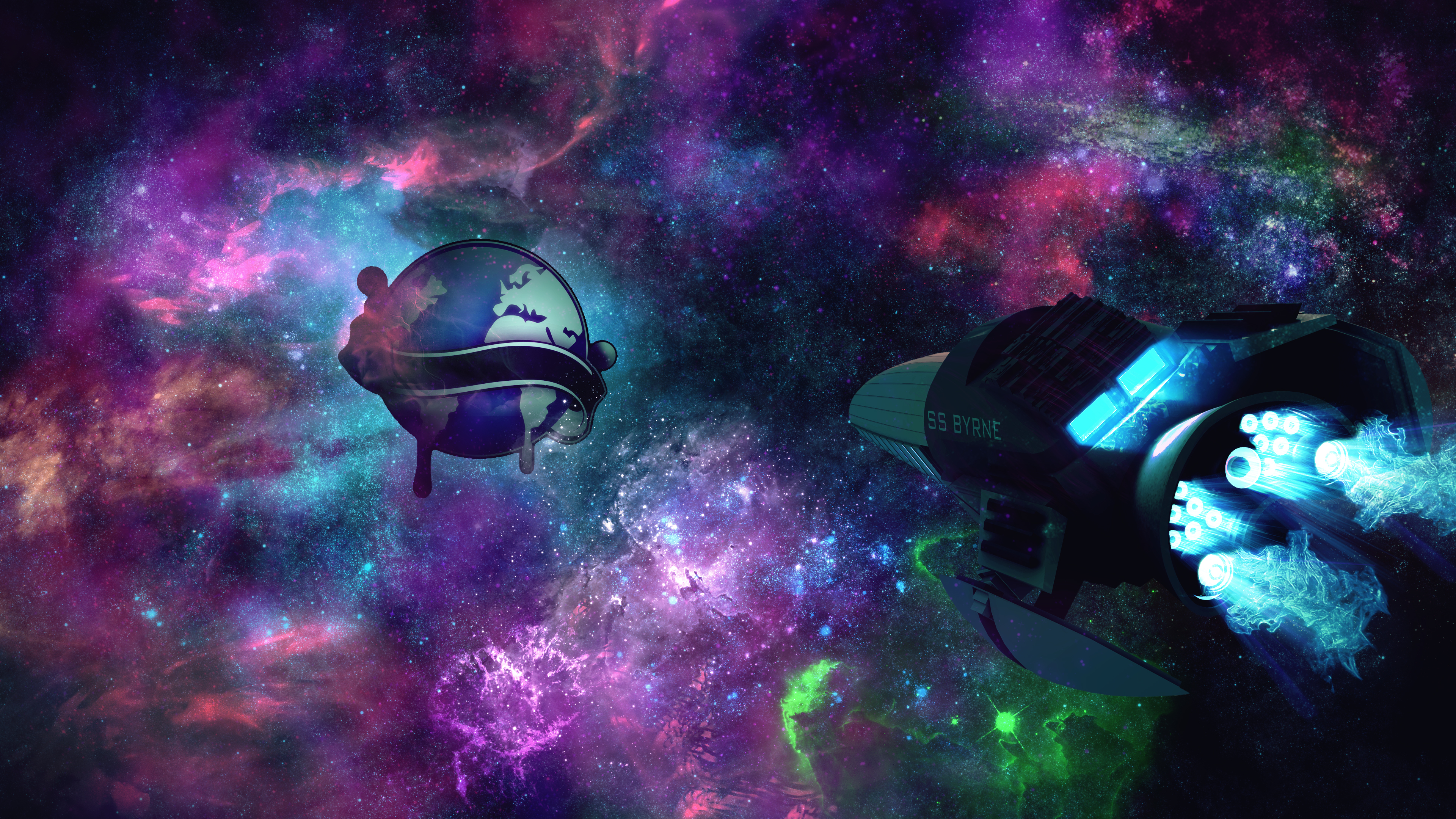
I'm a subscriber of Liquicity on Youtube, and I really enjoy his uploads.

I made this to show my appreciation


For credit, I used so many brush sets I really can't keep track of them all.

The space ship was modeled by me using Sketchup and 3ds Max.
The logo belongs to Liquicity

The brush sets belong to the appropriate owners.
:icon:
Add a Comment:
 
:iconneqzify:
I came here because of a youtube video comment and this is awesome. I think with a 3D Liquicity logo it would be even more epic
Reply
:iconrebel28:
Thanks, I do agree with that.

The reason I didn't make it in 3D is because of 1. I don't know if I could make the banner, 2. I'm not to good at texturing, and 3. I don't know if I could make the liquid drops falling off the planet.

--
Something that arises born of an idea, and into a creation, no matter the skill, will mean more to an artist.
_____________________________
If you are a good artist, please have the originality not to put a Homestuck troll on your artwork.
SAY NO TO SOPA
Reply
:iconthepal:
~ThePal Feb 6, 2012  Student Digital Artist
The ship could look like something from Mass Effect or something, nicely done. :)
But if I should critique, then I would say that the planet stamp thing doesn't fit too well in.

--
The FL Studio 10 Weilder!

Check out my music. :)

[link]
Reply
:iconrebel28:
Thanks.

The ship, was a little Mass Effect inspired, I love that game amongst many.
The crowning achievement for this graphic, was that the ship is the first 3D model I've implemented into one of my graphics, it certainly won't be the last.

The planet, is the logo of Liquicity.
The reason it's out of place is because I rushed it, rather than take the hours to make the logo 3D, or at least make it look 3D, I just used the plain logo.

Although, it is helpful that it doesn't look completely in place, because it means you notice it, which can be good if you want your logo to be noticed.
But yeah, I could've put more work into it.

--
Something that arises born of an idea, and into a creation, no matter the skill, will mean more to an artist.
_____________________________
If you are a good artist, please have the originality not to put a Homestuck troll on your artwork.
SAY NO TO SOPA
Reply
:icon:
Add a Comment: